Tools Used
- Figma
- Next.js
- Openai
Key Features
- AI Chat Bot
- Quiz to Determine Best Skill
- Skill Library
What is Pocket Prof?
Pocket Prof is a mobile web application goal tracking app that promotes a variety of skills a user can learn by gathering resources through our ai assistant Oscar. Through its interactive user-friendly features, it provides a platform for students and individuals alike to improve on themselves and create new goals."
Identifying The Issue
There was a gap found in the ability of finding new skills due to the overwhelming surplus of resources available of the internet. Through the app ideation proccess, we determined with the help of AI, we can collect all the available resources and make it available into 1 congestable application: Pocket Prof!
User Workflow

App Mockup

User Testing
Overview
- Participants: 5
- Completed: April 2024
The team underwent a rigourous usability test to evaluate users' ability to utilize app functions such as creating goals, testing oneself, discovering new skills, and making/tracking goals. With the main objective being to assess navigation through different screens to gauge overall experience and gather feedback for enhancing the app's design and user-friendliness.
Questions
- Navigate through the on-boarding steps and reach the ‘New Subject’ page.
- On the ‘New Subject’ page, navigate to the ‘art/creative’ section and create a goal list for a basic guitar course.
- Visit the profile page and change the user name.
- Add a goal individually, then add multiple goals to your account.
- Navigate to the settings page, switch to dark mode, and adjust the font size to large.
- Complete a quiz and review your results.
Key Takeaways
- We resized and changed colours to improve visibility
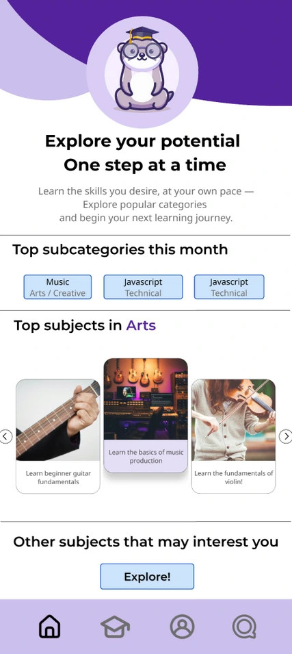
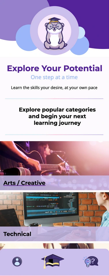
- For better clarity, we improved the design of the icons on the Navigation bar and reduced the number from 4 to 3.
- For better navigation and flow, we made the “New subject” page to homepage.
- This usability testing helped us point several areas for improvement. We aim to improve the design and flow of our app by incorporating the suggested recommendations so that we can enhance the user experience and satisfaction.
Problems / Solutions
Before
Users were confused by the relevance of our initial homepage and the importance / relevance of the home page vs our new learning subject page. Given that the new subject section is the primary focus / main function of the app, it’s important to clear up confusion regarding it’s relevance
After
Given that we could find a way to effectively implement the home page in the way that we would have liked (most of it relied on having pre-existing user data), we decided to combine the two pages into one, with the primary focus being on starting a new subject. This keeps the primary focus of the app where we intended, and removes one of the icons from our nav bar, streamlining the app and its navigation


Before
Three of the participants were not sure about the purpose of homepage and the feature of the elements on the homepage. That affected the entire workflow on the page and clarity of information presented on the interface.
After
The ‘New Subject’ page was combined with the homepage so users can have a better perception of the app. This change was done to engage users and follow the flow from the start, encouraging them to explore further.


